MinuteMinds:
an identity built on compression.

A complete brand identity for an AI company that makes long audio and video up to 90% shorter without losing what matters.

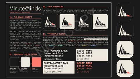
MinuteMinds brand identity guidelines: concept, logo variations, color system and typography
Client
MinuteMinds · minuteminds.ai
Services
Brand research and development, graphic design
Deliverables
Brand concept, logo system, color system, typography, brand guidelines
Year
2026

Make compression feel trustworthy.

MinuteMinds turns hours of recordings into short, intelligent summaries. The brand had to signal speed and efficiency without suggesting that anything important gets lost, and work as well on a dark app screen as on a pitch deck.
What we did

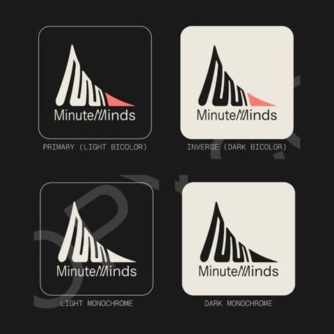
The MinuteMinds logo in four versions: light bicolor, dark bicolor, light monochrome and dark monochrome.
Logo variations
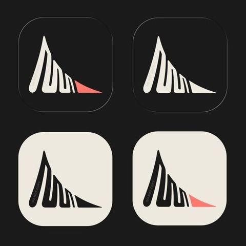
Four MinuteMinds app icons, two dark and two light, one of each with the coral tip.
App icons

Color system

Three brand colors carry the mark; four supporting accents are reserved for interface and data, never the logo.

  • OBSIDIAN#191A19
  • PARCHMENT#EEE9DF
  • CORAL#FF796F

Supporting accents

  • #79D6D1
  • #93E8B8
  • #D8B567
  • #91B7FF

Typography

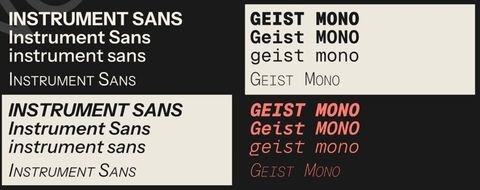
A dual-typeface system: Instrument Sans for modern, readable copy and Geist Mono for technical precision.

Type specimens from the MinuteMinds guidelines: Instrument Sans and Geist Mono in capitals, title case, lowercase and small capitals, upright and italic.

Results

A successful rebrand of the MinuteMinds product, delivered as a complete identity system with brand guidelines.

Services used

  • Brand development
  • Graphic, print and layout design

Building something
that needs a brand?

Tell us about it. We’ll reply within two business days.